My first ‘bigger’ personal R Project: A dashboard where users can upload their data to view some statistics about their netflix-watching behaviour.
After my first R Seminar in my Social Science Bachlorprogram I was hooked and wanted to keep learning R. My main motivation was to create some statistics about my personal life.
I was pleasantly surprised when I found out that it is possible to download a csv file of your watch-history on Netflix. I made this dashboard in german, maybe I will rework it some day to work in english aswell. Set the profilelanguage to german, navigate to “Titelverlauf”, scroll down and click “Alle herunterladen” on the right side. Upload the csv file to my dashboard that is hostet via shinyapps.io.
Interpretation of Example
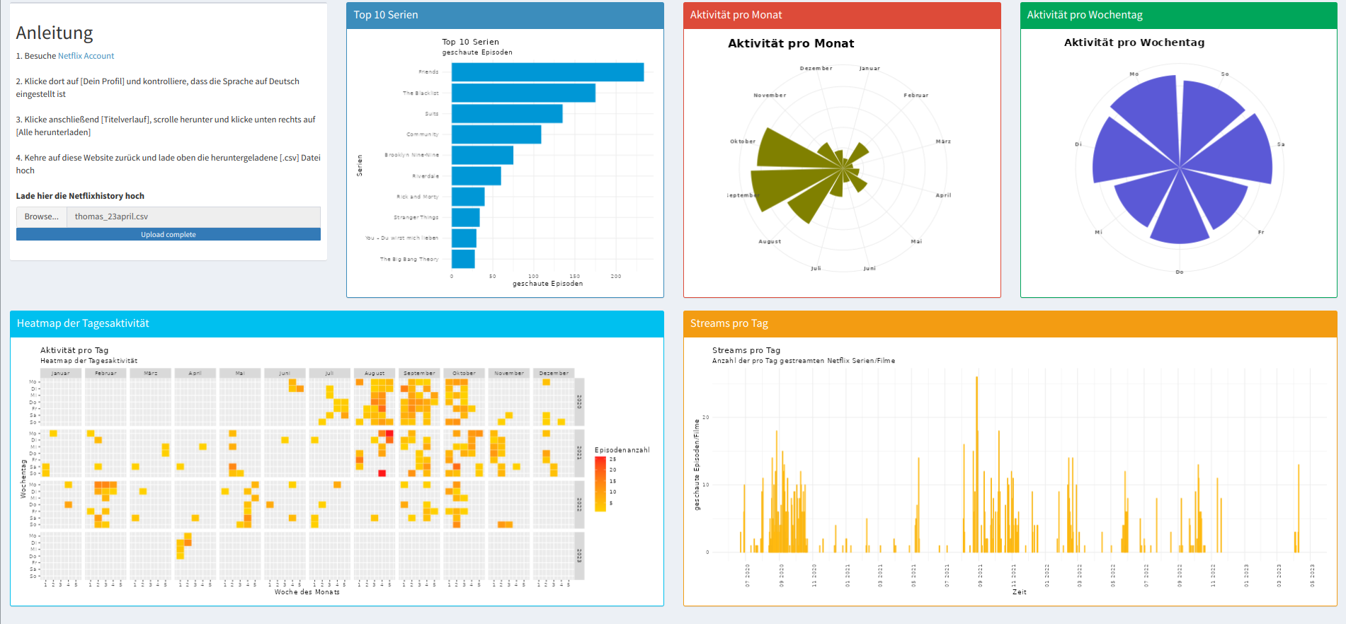
The Plots reveal not only interesting but quite useful information about my netflix-viewing behaviour. For example the timelineplot suggests that I tend to bingewatch. Compared to my friends, long periods without activity are followed by single days with very high activity.
The plot of the months shows that I watch Netflix almost only in August, September and October and that for about 3 years (see calendar heatmap). So I could save a lot of money if I subscribed to Netflix only in those 3 months and I wouldn’t even really notice. I explain the heavy usage of netflix in thoe months with the lecture-free period after the summersemesters.
I blame the heavy Netflix usage on a Monday on the following: I had no events on Monday for 2 semesters and a lot the rest of the week. On that day, however, all my friends are busy, which creates a situation that favors Netflix usage.
Overall, a peak during 2020 as the “year of the pandemic” and a general decline since then in my Netflix activity can be observed.